It’s hard to believe that my second year will be coming to an end in less than a month! Everything we’ve been working on all semester is starting to come together. I thought this would be a good opportunity to show some of my progress.
I recently was given the assignment to shoot some portfolio photography for a portfolio website I’m working on as part of my identity. I chose five projects to photograph, and chose appropriate props, backgrounds and lighting for each piece. Here is a look at the final layouts for the photography assignment. 
These three labels were designed for a live client this semester who developed a homemade jerk marinade using skotch bonnet peppers. The company was called Jambrica and had unique blend of Canadian and Jamaican influence. I wanted to design a label that had high contrast, bright colours and type as the primary focus to grab a shopper’s attention. The peppers were perfect for adding that extra pop of colour to my photos.
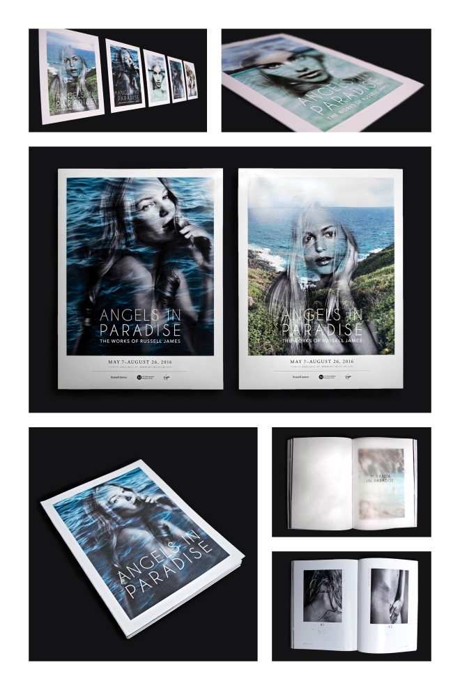 These postcards, posters and book were designed first semester for a museum guide. I created a fictional museum guide called Angels In Paradise, The Works Of Russell James. James is known for this exquisite photography of some of the Victoria’s Secret Angels on the private Necker Island. I created double exposures to combine the beauty of the angels with the photographs of the tropical island.
  The photos above are actually of a first year project that I had yet to shoot but was really proud of. I designed a book series on Mountains, using the element of colour to separate the books from each other. I chose pink for Kilimanjaro because the highlight of the hike is the summit in time for sunrise. For the Everest book I chose blue which reminded me of the snow caps on the Mountain. For the book on Machu Picchu I chose green because of the warmer climate and lush forests. All of the photography used within the book are my own and my families.
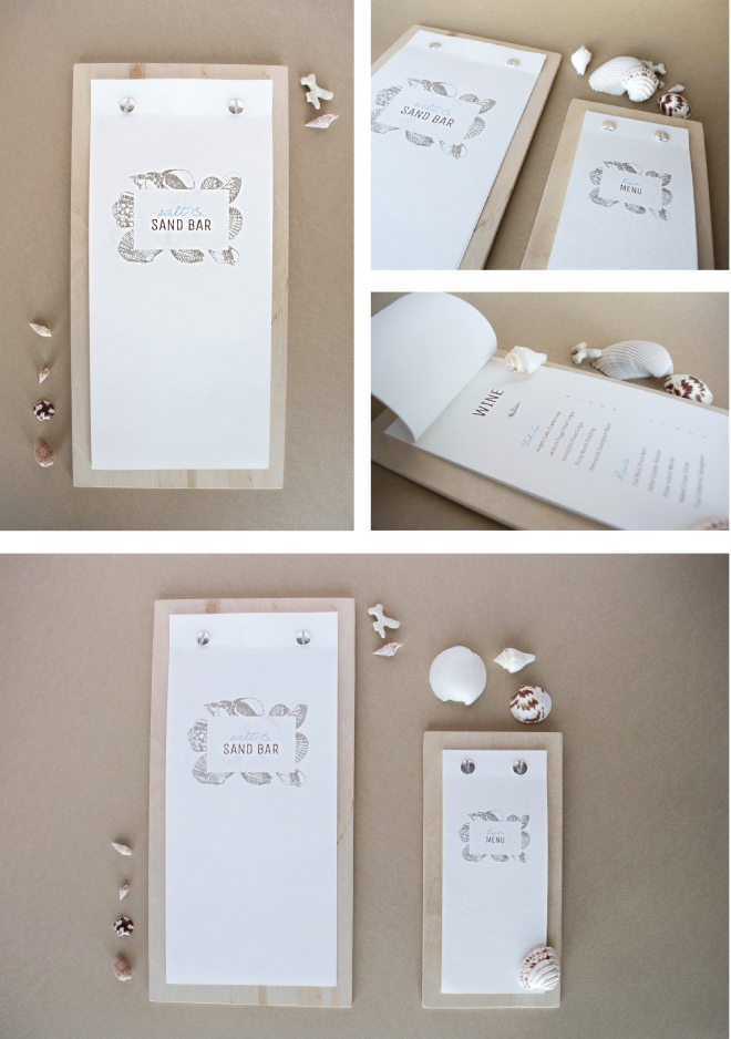
Salt & Sand Bar is a restaurant identity I developed for an assignment first semester. I designed and mocked up a menu for food and drinks for this coastal seafood restaurant geared towards young, hip professionals. I kept the photos simple and used small seashells as accessories. 
The final assignment I chose to shoot was a package redesign I created for an organic coconut body butter. I decided to use coconut shavings around the package to show off the organic ingredients of the product. Black is a great background colour for products like this to create high contrast to ensure the package and the coconuts stood out.
Here is a better look at the original photos.
Thanks for reading and checking out some of my work!
